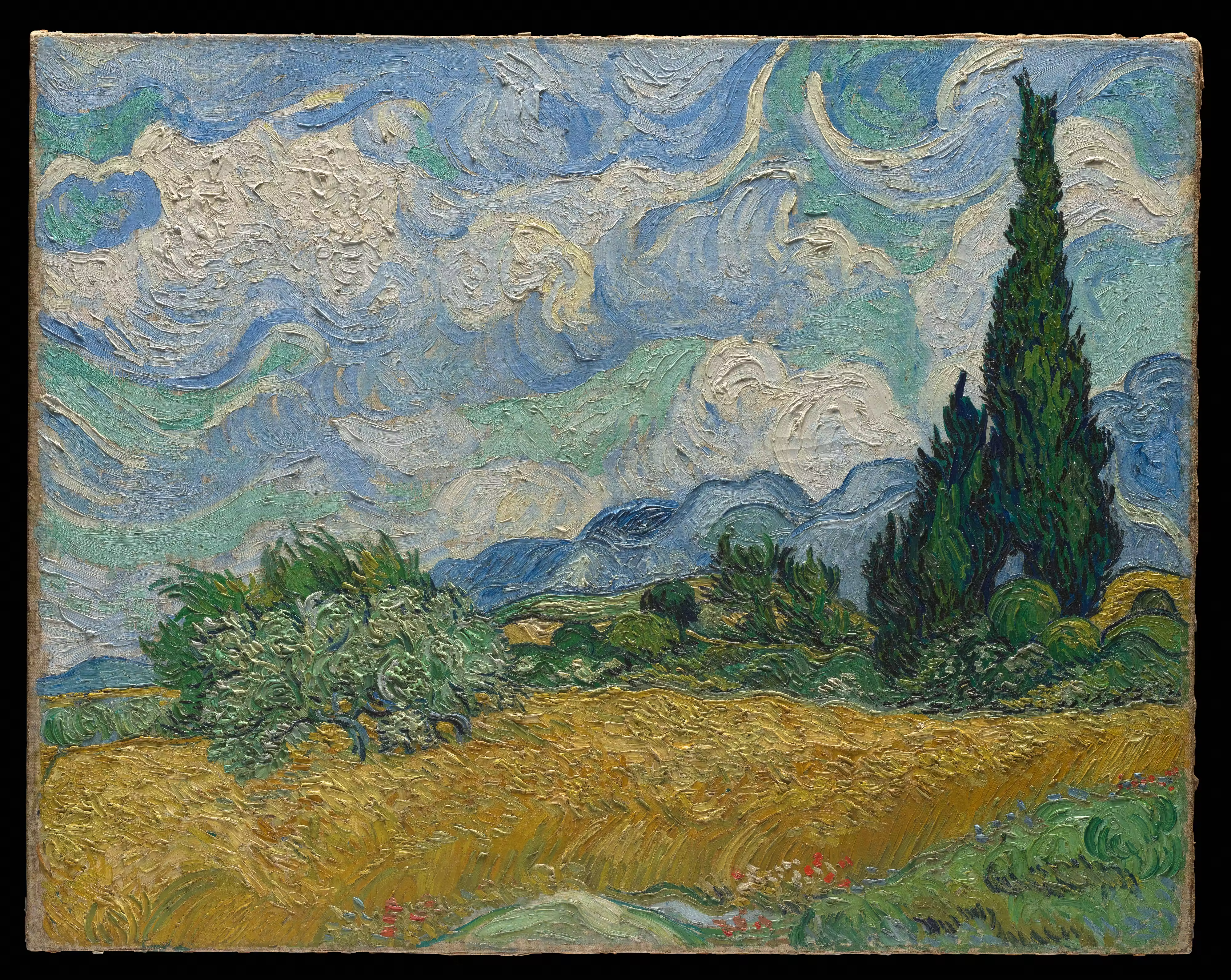
Van Gogh and the art of living landscapes: Secrets of “Wheat Field with Cypress Trees”
Summer in Provence — hot air shimmering above the ground, golden ripe wheat, and cypress trees that burst like dark flares on the horizon. Van Gogh never painted simply what he saw in front of him — he painted what he felt. In this painting, every brushstroke is a pulse, not just a description of nature. This is a story about how wind and sun become tangible to the touch.
The psychological dimension: Healing by nature
This work was created in the summer of 1889, shortly after “The Starry Night,” when Van Gogh was being treated at the Saint-Paul-de-Mausole asylum. But unlike the nighttime masterpiece he painted from memory in the ward, he worked on this landscape outdoors — in the open air. The doctors allowed him to go beyond the clinic grounds under supervision. The nature of the Alpine foothills (the Alpine massif) became his main therapy. He eagerly absorbed these colors, trying to find, in the turbulent yet life-giving landscape, a counterbalance to the inner demons that tormented him.
The anatomy of a masterpiece: What an artist should take a closer look at
The painting captivates with its dynamism. Here Van Gogh uses his signature impasto style, laying on paint thickly, like a sculptor shaping clay. These are the main compositional techniques:
- A single breathing rhythm: The sky, the field, the mountains, and the trees are rendered in almost the same rhythm of wavering strokes. Because of this, the painting “breathes” and vibrates in unison. The movement here is far more important than academic accuracy.
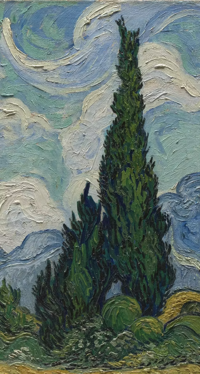
- Verticals vs. horizontals: The cypress trees reach upward like tongues of dark flame. They serve as a vertical bridge (an anchor) connecting the restless earth with the stormy sky, breaking up the horizontal waves of the field and hills.
- A “floating” horizon: The lines of the mountains and the field are uneven; they flow into one another. This is not a perspective mistake, but a deliberate intention to convey the mistral — a strong Provençal wind that bends everything in its path.
Color palette: The contrast of heat and coolness
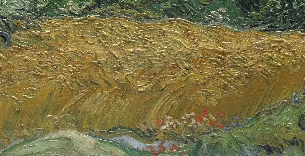
Van Gogh was a genius of color. In this work, he plays with a strong temperature contrast. Rich, almost hot Indian yellow (the color of ripe wheat) occupies the lower third of the canvas. To balance this heat, he uses cool blues, greenish tones, and whites for the sky. And the cypresses — the darkest spot — are painted in deep emerald and nearly black shades, creating the perfect visual pause amid this riot of light.
Interesting facts that not many people know
- Obsession with cypresses. During this period, Van Gogh was literally captivated by these trees. In letters to his brother, he wrote: “The cypresses are constantly occupying my thoughts… I’m amazed that no one has painted them yet the way I see them. In terms of their lines and proportions, they are just as beautiful as an Egyptian obelisk”.
- Three versions of the same field. The artist liked this subject so much that he created three paintings with this landscape. The first (the one that’s in the article) was painted in the summer from life, and the other two he made later in the studio, in the autumn of the same year, to send the materials to his sister and her.
- Struggle with the wind. Painting this picture outdoors was a real challenge because of the mistral. The artist had to tie his easel to pegs driven into the ground so it wouldn’t be blown over. Perhaps it was this resistance to the elements that made the brushstrokes so energetic and aggressive.
What this masterpiece gives a modern artist
If you draw landscapes, this work is a great example of how to get rid of the “dryness” in academic painting:
- Unified stroke: A uniform stroke all over the work (in the sky, the ground, and the objects) can connect separate elements into a single, powerful mood.
- Emotion instead of a camera: A landscape isn’t copying nature — it’s translating your emotion into form and color. Allow yourself to exaggerate.
- The power of the imperfect: Don’t be afraid of a “uneven” or trembling line. A living, energetic, and imperfect one often convinces and hooks the viewer much more than perfectly drawn lines.
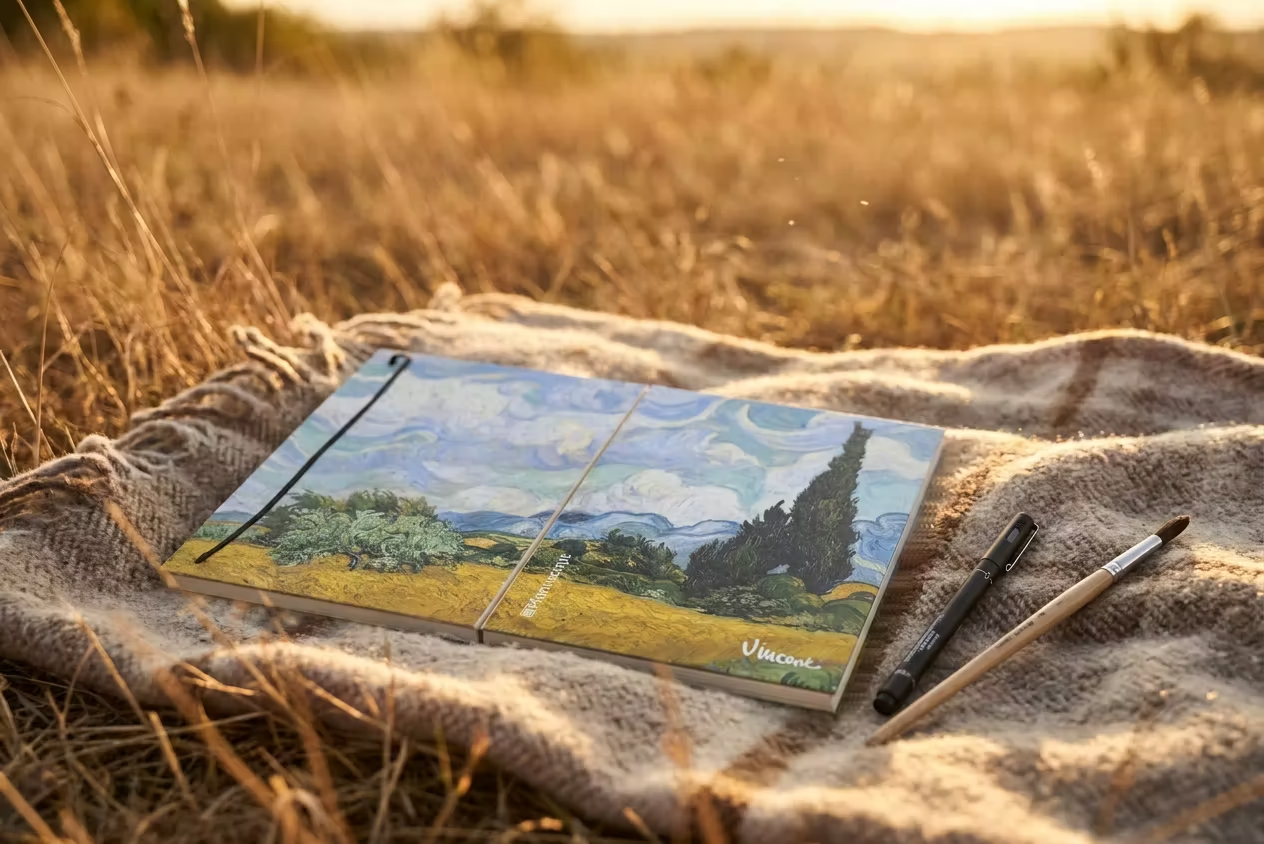
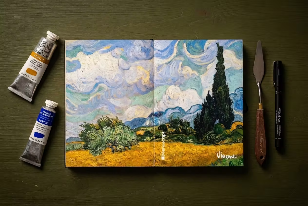
To feel these techniques on your own page, you need the right paper that can handle the expressiveness. Swedish design paper (150 g/m²) in Manuscript Plus premium sketchbooks holds several layers of media without warping. You can apply paint, draw thickly with a liner or ink — the page will stay smooth. It’s time to create your own living landscapes!