Kandinsky: Color, Form, and the Inner Music of Abstraction
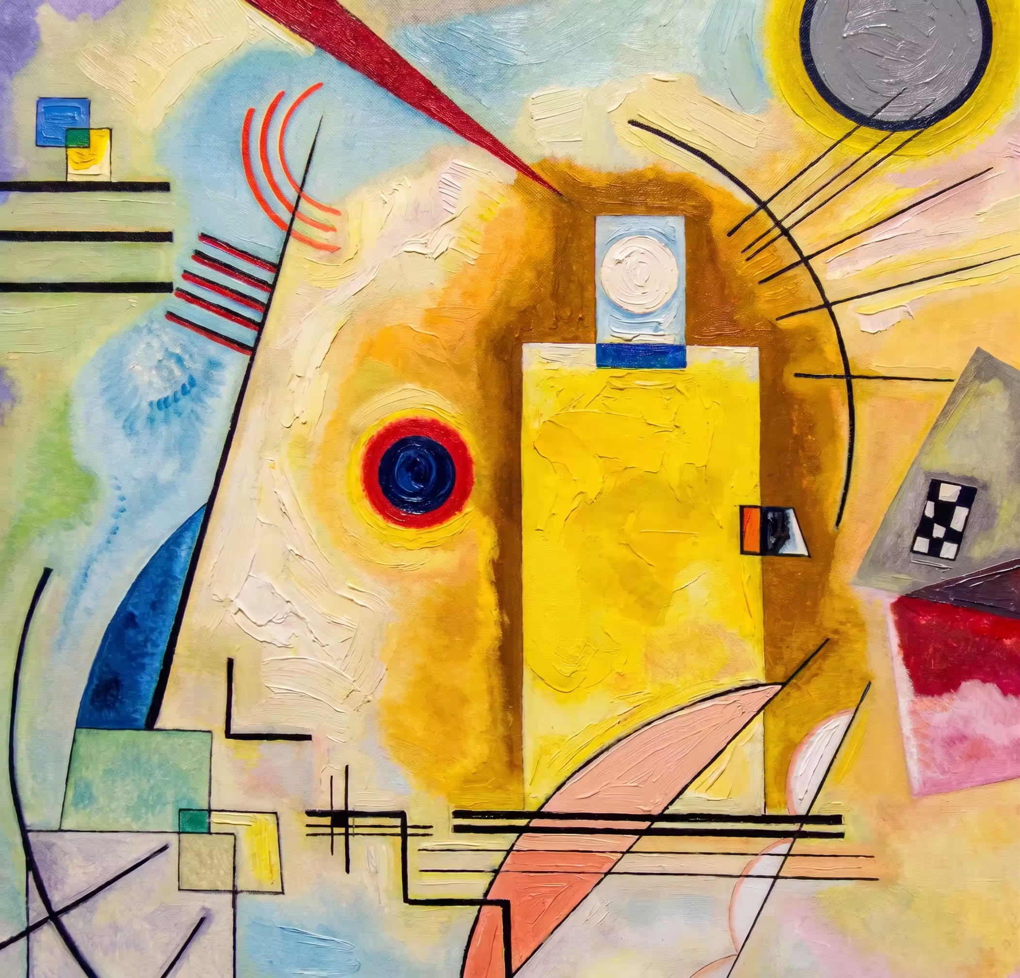
«Yellow-Red-Blue» (1925) is not just about colors on the canvas. It is about fundamental values and energies. For Kandinsky, yellow meant warmth, grounded vitality, freedom, and even aggression; red — boiling power, the pulse of life, inner tension; blue — calm, endless depth, spirituality. Kandinsky believed that painting can sound just like a symphony — and this painting makes us not only see, but also hear.
The Story of Creation: Geometry of Emotions Within the Walls of the Bauhaus
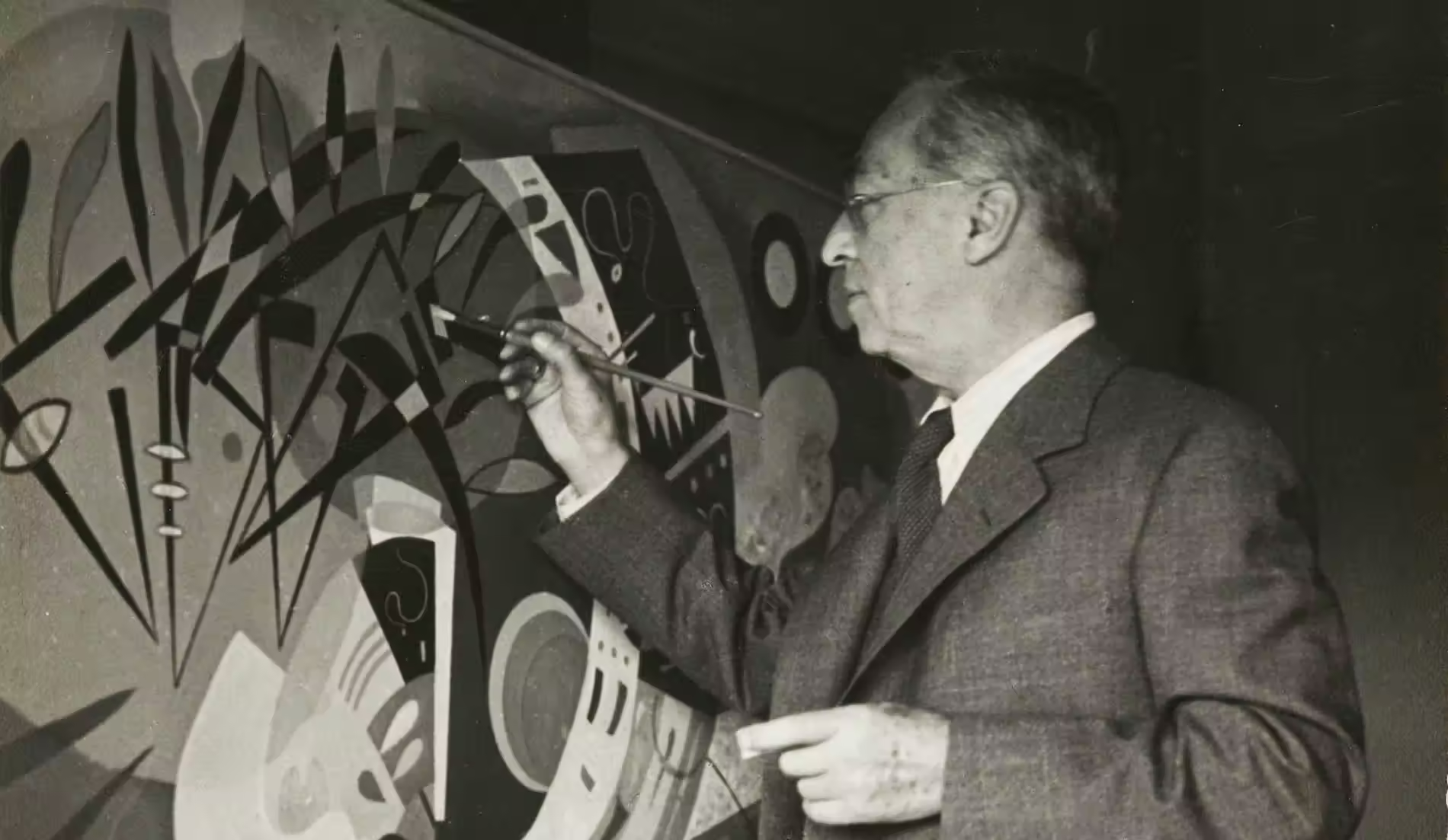
The painting was created in 1925, when Kandinsky was teaching at the famous German School of Art and Design Bauhaus (Bauhaus) in Weimar. Before that, his abstractions were more lyrical, chaotic, and blurred. But at the Bauhaus, architectural logic and constructivism prevailed.
«Yellow-Red-Blue» became the ideal synthesis of two worlds: Kandinsky’s passionate, mystical emotionality and the Bauhaus’s cold, precise geometry. It was a period when he explored the interaction of basic colors with basic forms (yellow triangle, red square, blue circle), trying to create a universal visual grammar understandable to every person regardless of their culture.
What you should take a closer look at here
- Reading left to right: The painting is read like a musical score. The left side is yellow, bright, restless, made up of sharp angles and lines. It is dynamics and an explosion. The right side is blue, dark, rounded. It is the center of gravity, a cosmos, and calm. The red elements in the middle work like a bridge, restraining the tension between these two poles.
- Forms as meanings: The forms here are not decorative, but functional. The large blue circle is enclosure and a deep spiritual immersion; sharp yellow triangles are tension, motion upward; floating spots are the breath of the composition.
- “Nerves” of the composition: Pay attention to the black lines. They run through the canvas, creating a framework. Some of them resemble chessboards, others — a snake or musical staffs. The fine black line in the lower-right corner slices through the blue zone, like an arrow — a powerful emotional accent that fixes and balances the entire composition.
- Hidden figures: Although this is an abstraction, some art scholars see the profile of a person’s face in the left yellow section, while others believe the painting is a stylized depiction of Saint George’s battle with the serpent.
Interesting facts
- Kandinsky’s synesthesia: The artist had a rare neurological trait — synesthesia. He literally “heard” colors and “saw” sounds. For him, yellow sounded like a sharp, brazen trumpet; red — like strong, confident drum or tuba strikes; and blue — like a deep, sustained cello sound that transitions into the sound of an organ.
- Scale matters: This work is one of the largest of his output from that period — it measures 128 by 201.5 cm. It was not conceived as a small, intimate painting, but as a monumental statement.
- “Degenerate Art”: In the 1930s, the Nazi regime in Germany declared Kandinsky’s works “degenerate.” Dozens of his paintings were confiscated and destroyed, and the artist had to emigrate to France.
What it gives the artist
- Color isn’t decoration, it’s a choice. Kandinsky proved that each shade has a clear psychological meaning. Understanding this means learning to speak with colors intentionally, influencing the viewer’s subconscious.
- Speak in lines, not words. A line can be anxious, calm, aggressive, or playful. Its thickness, speed, and direction are not just outlining a contour — they are an action, they are an emotion, they are an emotional word.
- Every element has weight. Even in a simple sketch: the place where you position an object changes the meaning of the entire work. Balancing visual weight (like how a heavy blue circle balances many scattered yellow spots) is the key to a strong composition.
Abstraction is a genre that requires paper that doesn’t interfere with either lines or spots. The Kandinsky 1925 Plus sketchbooks are made on Swedish design paper with a creamy tint, 150 g/m² — this warm, neutral background doesn’t distort colors and lets pigments (whether markers, watercolor, or liners) sound vivid and clean, like in an orchestra.