You are never left without a model. Wherever you go — at home, in a café, on a train — hundreds of objects surround you, and each one can be drawn. A cup on the table. A stack of books. A bottle of oil. A shoe by the door. They don’t move, don’t get tired, don’t ask for a break. And if you want to learn how to draw, you should start with them.
But «just draw a cup» and «understand how a cup is constructed in space» are completely different things. In this material, we’ll go from basic understanding of shadow to working with light, form, perspective, and texture — all on specific objects, without unnecessary theory.
Why it’s important to learn to draw objects
Drawing from life is the most direct path to understanding form. When you look at a real object, you instantly see everything: how the light falls, where the shadow forms, how the form foreshortens in perspective, what the surface texture is like. Your brain gets the full picture, and your task is to learn how to reproduce it.
Unlike drawing from a photograph or an internet reference, working with a real object gives you volume: you can rotate it, change your viewing angle, move the light source. This is active exploration of form, not passive copying.
Another advantage: objects teach you to observe. Most beginners draw what they think they already know — «a cup in general», «a house in general». But every real cup is unique. It’s this habit of looking — not remembering — that makes the drawing convincing.
Finally, objects are an endless library of shapes. A cube, cylinder, cone, sphere — these basic solids underlie any complex object. Once you learn to draw a book (a parallelepiped), you’ll understand how to draw a building. When you master a jar (a cylinder), you’ll be able to draw a column or a tree.
Shadow: not a black color, but the absence of light
One of the most common mistakes beginners make is to draw shadow in black or gray evenly. But shadow isn’t a «color» — it’s the absence of direct illumination. And in that absence, there are always nuances.
Look at any illuminated object. Where direct light hits, that’s the brightest part. Then a smooth transition into shadow begins — and it’s this transition that conveys volume. The darkest part of the shadow isn’t at the edge of the object, but slightly closer to the line of the «terminator» — the boundary between light and shadow. And closer to the edge, the shadow is slightly brightened by reflected light from surrounding surfaces.
The shadow an object casts onto a surface is a separate shadow with its own rules. It’s darker near the base of the object and gradually softens toward the edges. These two shadows — the shadow on the object itself and the shadow on the floor — have different character, and it’s important not to mix them up.
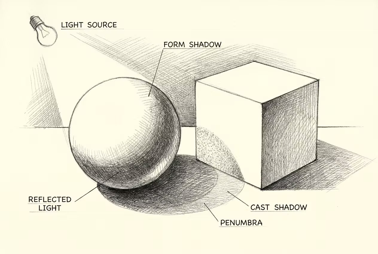
Four types of shadow: what everyone needs to know
To confidently draw any illuminated object, you need to distinguish four types of shadow. This isn’t academic theory — it’s a practical tool for observation.
1. Form shadow (shadow of form)
This is the part of the object that doesn’t receive direct light. It depends on the form of the object itself. On a cube, it’s a clear straight boundary. On a cylinder or sphere, it’s a smooth gradient. It’s the form shadow that conveys the object’s three-dimensionality: without it, everything looks flat.
How to practice: Take an apple or an orange and illuminate it with one light source. Find the boundary between the lit and shaded parts. Draw only this boundary — the «terminator». Then gradually fill in the shaded side, making it darker toward the center and slightly lighter near the edge (reflected light).
2. Cast shadow (cast shadow)
This is the shadow an object casts onto surrounding surfaces. The shape of a cast shadow depends on three factors: the form of the object itself, the angle at which the light hits, and the tilt of the surface the shadow falls on. A cube on a horizontal floor will produce one shadow silhouette, but if the floor is tilted, the shadow will deform.
A characteristic feature of a cast shadow: it’s darker and sharper near the base of the object, where the distance is minimal, and it gradually softens and lightens toward the edges — because the light source has a certain size and the rays diverge slightly.
How to practice: Place a book vertically and illuminate it with a lamp from the side. Observe how the book’s shadow stretches across the table. First, draw only the outline of this shadow, then fill it in, taking into account the sharpness near the base and the softness toward the edges.
3. Penumbra (half-shadow)
Penumbra is the transition zone between full illumination and full shadow. It happens because real light sources have sizes (even a light bulb isn’t a point). The closer the object is to the surface, the sharper the edge of the shadow. The farther it is, the wider and more blurred the penumbra.
This knowledge is important for realism: if you draw a very crisp edge of the cast shadow where the object is far from the surface, the drawing will look unnatural.
4. Reflected light (reflected light)
Even in a shaded area, there is a little light — light reflected from the floor, walls, and neighboring objects. It makes the shadow «alive» and prevents it from being solid black. On a sphere, this shows up as a slight brightening of the shadow edge. On a cube, it’s a barely noticeable illumination of the lower part of the side face.
But it’s easy to overdo reflected light: if you make it too bright, the object will lose the sense of shadow. Rule: reflected light is always darker than the darkest lit zone.
What is form and how to see it: a lesson from «Perspective Made Easy»
Before you draw shadows, you need to learn how to correctly build form in space. One of the simplest and most effective books on this topic is Perspective Made Easy by Ernest Norling. Written back in the 1930s, it still remains one of the best introductions to perspective — thanks to clear language and a practical focus.
Norling explains perspective through one simple object: a cube. If you can draw a cube in any position, you already understand perspective.
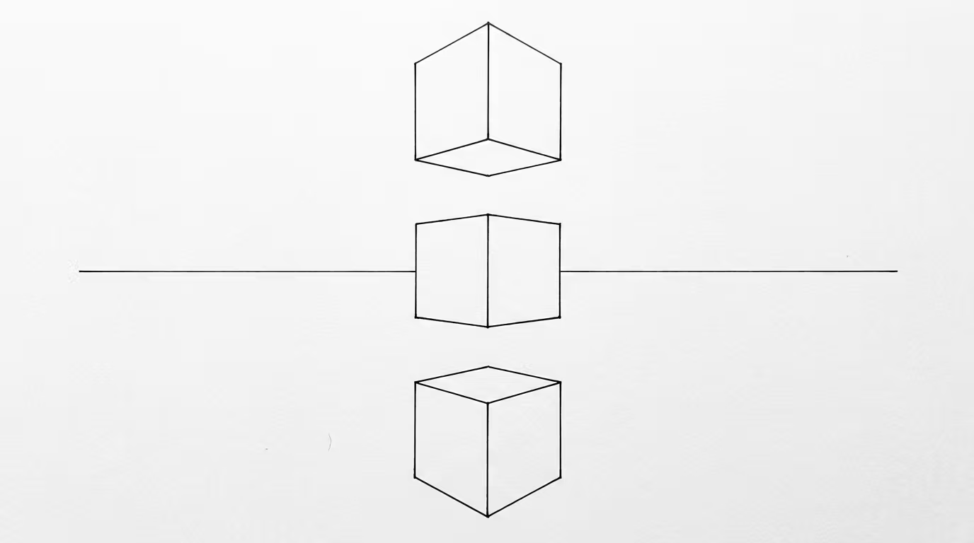
Horizon line and vanishing points
The horizon line is your eye level. If you stand, it’s about 160–170 cm above the floor. If you sit — lower. If you lie down — almost at floor level. This matters: the horizon line changes with your position.
Vanishing points are points on the horizon line where the parallel lines of an object «converge». In normal two-point perspective, a cube has two groups of horizontal edges, and each group converges to its own vanishing point.
Norling demonstrates it with a simple example: imagine you’re standing at an intersection and looking at a house on the corner. The left side of the house «stretches» toward the left vanishing point, the right side — toward the right. And both points lie on the same line — the horizon line.
How a cube changes depending on the viewing angle
One of the key lessons from the book: a cube looks different depending on where it is relative to the horizon line.
- If the cube is below the horizon line — you see its top face (looking from above).
- If the cube is at the level of the horizon line — the top and bottom faces disappear; you only see the side walls.
- If the cube is above the horizon line — you see its bottom face (looking from below).
It’s not intuitively clear the first time, but once you’ve «seen» it, you’ll never draw a cube «crooked» again. This is exactly the moment Norling illustrates with dozens of simple examples.
A practical perspective exercise
Place a book or a box on the table. Draw a horizontal line at eye level. Put two vanishing points far apart on both sides. Now draw the object, leading all the horizontal edges to their corresponding vanishing points. The vertical edges remain vertical.
Make three variations: the object below the horizon line, at the level, and above it. Compare the results — you’ll see how the «look» of the same box changes.
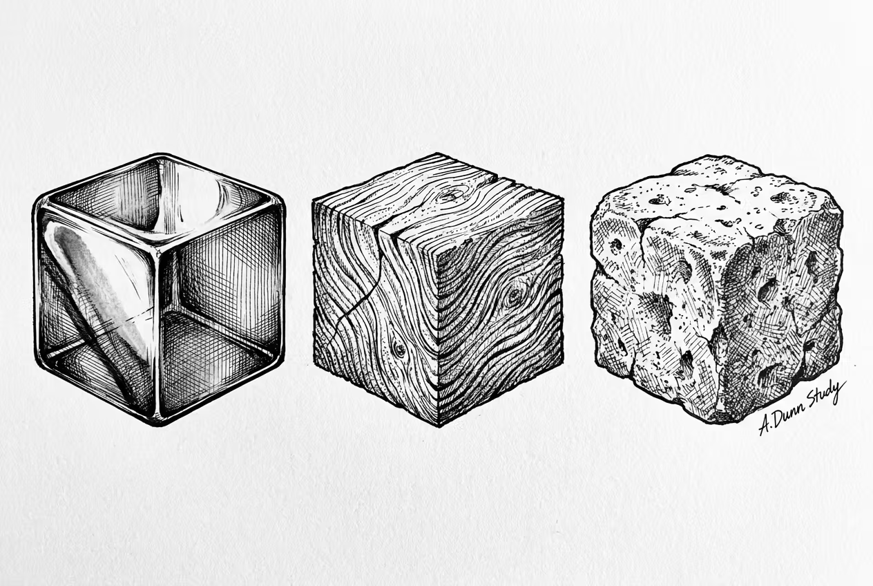
Textures and materiality: «texture cubes» by Alphonso Dunn
Once the form is built correctly, the next question is how to convey the material. Metal looks different from wood. Wool is different from stone. And it’s not only about color: different materials reflect light differently and have different surface structure.
In his Pen and Ink Drawing Workbook, Alphonso Dunn offers a brilliantly simple idea: draw the same cube, but each time from a different material. This is a «texture cube» exercise — it trains both observation and technical execution at the same time.
Five basic textures and how to render them
Metal. A smooth surface with sharp, high-contrast highlights. Key feature: specular highlights have a crisp edge and transition into darkness very quickly. On polished metal, the surrounding environment is reflected in a distorted way. Technique: sharp transitions between light and dark, minimal mid-tones.
Glass. Partially transparent, partially reflective. It has both highlights (like metal) and the appearance of what’s inside or behind it at the same time. Rendering technique: leave «windows» of white space where there are highlights, and add light hatching for volume.
Wood. A warm texture with visible fibers. The fibers run along the grain and slightly wave. Technique: the hatching lines follow the direction of the fibers. On the end-grain cut, there are concentric circles of the annual rings.
Stone. A matte surface with a random texture. No straight lines — only irregular spots and transitions. Technique: chaotic hatching, uneven edges, «grainy» transitions between tones.
Wool or fabric. A soft, fuzzy surface without clear highlights. The shadow is very blurred, and transitions are smooth. Technique: light, short strokes in different directions, without sharp boundaries.
Practical exercise: texture cube
Draw five identical cubes on a sheet of paper in the same position with the same lighting (one light source from the upper left). Now make each cube out of a different material from the list above. Don’t change the shape or placement — change only the surface rendering technique.
This exercise perfectly shows how hatching technique and the handling of highlights change the «feel» of the same object. That’s exactly what Dunn says: materiality is the language of lines and tones, and this language can be learned.
Video by @my_art_bar
How light falls on surfaces: a lesson from Scott Robertson «How to Render»
If Norling teaches you how to build form, and Dunn teaches you how to convey texture, then Scott Robertson in How to Render explains the physics of light itself. It’s the most technical of the three books, yet at the same time the most useful for those who want to understand why a drawing «looks right» or not.
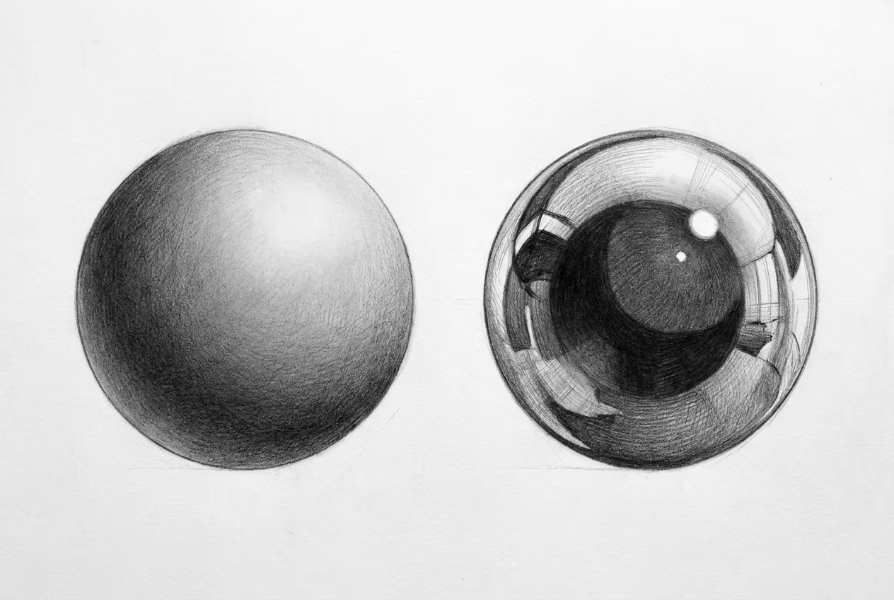
Robertson starts with a fundamental distinction: there are two types of light reflection from a surface — diffuse (diffused) and specular (specular). Almost all real materials are a combination of these two types in different proportions.
Diffuse reflection: matte surfaces
A matte surface scatters light evenly in all directions. That means the brightness of such a surface does not depend on your viewing angle — it’s the same everywhere. Brightness depends only on the angle of the incoming light: the more the surface «faces» the light source, the brighter it is.
That’s why on a matte sphere we see a smooth gradient from the brightest point (where the surface is perpendicular to the direction of the light) to the dark edge. No sharp highlights — only an even, predictable transition.
How to draw a matte surface:
- Find the point of greatest brightness — it’s where the surface is «facing» the light source directly.
- From it, build a smooth gradient toward the shadow side.
- No sharp highlights or crisp edges in the transitions.
- The terminator (shadow/light boundary) is smooth, but visible.
Specular reflection: glossy and mirror-like surfaces
A glossy surface reflects light directionally — like a mirror, but «blurred». The more polished the surface is, the smaller and sharper the highlight. The rougher it is, the larger and more blurred it becomes.
The key difference from a matte surface: the highlight depends on your viewing angle. If you move relative to the object, the highlight moves with you. That’s a sign of specular reflection.
Robertson shows this with a simple diagram: a ray of light is reflected from the surface at the same angle (angle of incidence = angle of reflection). Your eye «sees» the highlight only when it is in the correct position relative to that angle.
How to draw a glossy surface:
- Add to the matte gradient a sharp, small highlight at the point where the angle-of-reflection condition is met.
- Around the highlight, add a small «crown» of slightly lighter tones.
- The transition from the highlight to the overall tone is sharp, not blurred.
- A dark «ridge» around the highlight — a characteristic sign of gloss.
Mirror-like surface
On a mirror-polished surface (a chrome part, liquid, polished metal), reflections of the surrounding environment become dominant. Robertson explains that in such a case, the diffuse component is almost zero — the surface shows only reflections.
That’s why a drawing of a chrome object is, essentially, a drawing of a distorted reflection of the surrounding environment. If it’s dark around, the chrome will be dark. If there’s a bright background, the chrome will «pick it up» and display it in its curved faces.
Practical exercises with Robertson
Robertson recommends a set of specific exercises to consolidate understanding of surface types.
Exercise 1 — Matte sphere. Take any round ball (or draw a circle). Illuminate it with one light source. Draw only diffuse illumination: find the brightest point, build a gradient from it, and add reflected light on the dark side.
Exercise 2 — Glossy sphere. Same sphere, but now imagine it’s made of polished stone or plastic. Keep the entire diffuse gradient and add a small sharp highlight. Compare with exercise 1 — the difference will be immediately visible.
Exercise 3 — Comparing materials. Draw four identical small cubes side by side: matte (plaster), semi-glossy (plastic), glossy (ceramic), mirror (metal). This is the «scale» between diffuse and specular. Once you’ve done this exercise, you’ll never confuse what each material looks like.
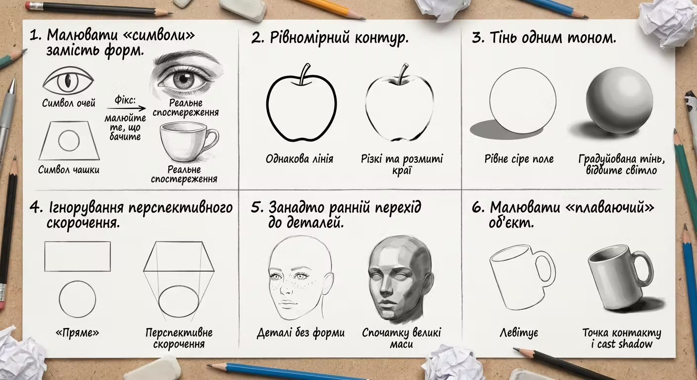
Main mistakes beginners make
Certain mistakes are made by almost everyone. Knowing them in advance, you can avoid them or fix them quickly.
1. Drawing «symbols» instead of forms. The «eye symbol» is an almond-shaped figure. The «ear symbol» is a bracket. The «cup symbol» is a trapezoid with a circle on top. Your brain inserts these simplifications instead of real observation. Fix: draw what you see, not what you «know».
2. An even outline. Beginners draw the outline with the same line all the way around the perimeter. But in reality, the object’s edges «appear» and «disappear» depending on lighting and material. Some edges are sharp, some are blurred — that’s exactly what conveys three-dimensionality.
3. Shadow in one tone. As we already said, shadow isn’t a uniform gray field. It’s graded: there’s reflected light inside it, and there’s a difference between form shadow and cast shadow. Even shadow «kills» volume.
4. Ignoring perspective foreshortening. Circles become ellipses, rectangles become trapezoids, and parallel lines converge. If you draw «straight» what is actually foreshortened in perspective, the form will look crooked.
5. Too early a transition to details. Beginners often start rendering details before the basic form and tonal relationships are established. As a result, you have details, but the object isn’t readable. Rule: first the large tonal masses, then the mid-tones, and only at the end — small details.
6. Drawing a «floating» object. If the object isn’t connected to the surface — by the shadow, the base line — it looks like it’s levitating. Always draw the contact point and the beginning of the cast shadow.
Practical exercises to get started
Here’s a set of specific exercises that cover everything we discussed above. Start with simple tasks and gradually make them more complex.
Week 1: Form and shadow
Days 1–2: Cube and book. Draw a box or a book in two-point perspective. Illuminate it with one light source. Draw form shadow and cast shadow. Goal: understand the basic shadow structure on flat surfaces.
Days 3–4: Cylinder and jar. The cylinder is the most common shape around: cups, bottles, candles. Draw a regular jar. Pay attention to how form shadow on a cylinder is a smooth gradient, not a sharp edge. Find the highlight and reflected light.
Days 5–7: A complex scene. Set three or four different objects on the table: a book, a jar, an apple, a pencil. Draw the whole scene with one light source. Watch where objects overlap each other and how their shadows interact.
Week 2: Textures (by Alphonso Dunn)
Days 1–3: Five texture cubes. Do the «texture cube» exercise described above. Two cubes per day — don’t rush; each material deserves thoughtful practice.
Days 4–7: Real objects and textures. Find at home objects made from different materials: a ceramic mug, a metal spoon, a wooden board, a piece of fabric. Draw each one, focusing on conveying the material rather than an exact outline.
Week 3: Surfaces and light (by Robertson)
Days 1–3: Three spheres. Draw matte, glossy, and mirror-like spheres. This can be an imaginary exercise (without a real model) — simply apply what you know about diffuse and specular reflection. Compare your results.
Days 4–7: Everyday objects by surface type. Find at home one example each of matte (a wall, soap, paper), semi-gloss (a plastic bottle, a glossy magazine), and glossy (a ceramic plate, polished metal) objects. Draw each one, focusing specifically on the character of light reflection.
Ongoing practice: «two objects per day»
After three weeks of the beginner course, move on to a daily sketch. The rule is simple: two objects every day. One simple (a coin, a button, a pen), one complex (shoes, a plant, a technical device). 15–20 minutes for each. After a month, you’ll notice that your hand «knows» where to go.
A sketchbook as an archive
A sketchbook isn’t a place for «finished works». It’s a lab. Here you test things, make mistakes, return to the same object after a month — and you see how your perception has changed.
Sign your drawings with the date and a short context: what it is, where you were, what the lighting was like. After a year, these notes will become your personal progress journal. You’ll see how your lines changed, how you started seeing shadows where you previously saw only a «dark spot».
Important: don’t choose «beautiful» objects. Draw what’s nearby. A coffee jar, an old shoe box, a pile of coins — each of these objects contains a lesson about form, light, and material. If you learn to see that lesson, you’ll become an artist.
A good sketchbook is the one you use. Not the one that sits on the shelf. Open it today, put any object in front of you, and start.